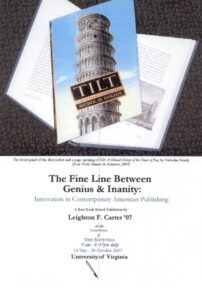
The Fine Line Between Genius & Inanity: Innovation in Contemporary American Publishing
Date:
14 May 2007 – 30 October 2007
Location: Dome Room, UVA Rotunda
Curated by: Leighton F. Carter '07
As a physical object, the book is conservative; there have been no major changes in  its format for more than a millennium. Over the centuries, readers have developed an almost unalterable idea of how a book should look and feel. In the increasingly jaded climate of 21st-century society, however, readers also hunger for the new and improved. Publishers are thus faced with a challenge: how to revitalize a book’s format while maintaining its traditional appeal.
The cover and dust-jacket of a book provide a blank slate for publishers to fill with arresting text, images, blurbs and graphics. If a dust-jacket does not cover a book, the binding itself must catch the potential buyer’s eye. Publishers alter the physical make-up of a book to differentiate it from its competitors. They play with different sizes and shapes to integrate form with content to give a greater feeling of action to the book. The most innovative spins on traditional formatting move the book forward into uncharted territory.
This exhibition presents about 115 books (and near books) that have innovative designs or other remarkable features. Most— though not all—of them were published in the last decade or so; but innovation in book design is nothing new; publishers have been tinkering with the physical format of their books for centuries.
