Bound to Please: American Cloth Bookbindings, 1830–1910
Date:
13 November 2006 – 1 May 2007
Location: Dome Room, UVA Rotunda
Curated by: Vincent Golden
The RBS exhibition “Bound to Please: American Cloth Bookbindings: 1830–1910,” explores the chronological development of cloth binding styles in the United States. The books on display in the Dome Room of UVA’s Rotunda have been drawn from RBS’s study collection of about 5,000 cloth bindings (now housed in Alderman Library’s McGregor Room).
The 300 books in the exhibition have been arranged and described by decades, an organizational scheme that does not always account for binding styles and features popular over long periods of time. This being said, enough information is provided in the exhibition labels, decade by decade, to enable viewers to ace the test they encounter in the final case of the exhibition: a dozen unidentified bindings they are invited to date to the proper decade. Come try your hand at it, if you’re in the neighborhood!
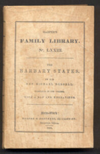
Printing directly on binder’s cloth (1835)
Bound to Please: American Cloth Bookbindings, 1830–1910 explores the chronological development of cloth binding styles in the United States. The books shown in this exhibition have been drawn from the pedagogical collections of Rare Book School (RBS), a UVA-based institute that supports the study of the history of books and printing and related areas such as type, paper, and illustration.
The books in the exhibition are arranged and described by decades, an organizational scheme that does not always account for binding styles and features popular over long periods of time. This being said, enough information is provided, decade by decade, to enable you to ace the test you will find at the other end of this exhibition; after viewing “Bound to Please,” see if you can date the unidentified test bindings in the case by the elevator!
Setting the Scene
In the second decade of the 19th century, British manufacturers began to make dyed and grained cotton yard goods impregnated with water-resistant filler materials. The treated cloth could be pasted to a cardboard base without damage to the outward-facing side of the cloth in order to create handsome and relatively inexpensive ladies’ summer hats (think Jane Austen movies). In the 1820s, British and (very shortly thereafter) American binders began to use these attractive dyed and patterned calicos to cover books: cloth was sturdier and more attractive than paper, and much cheaper than leather.
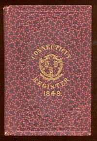
Gold–stamped vignette on
diagonal–rib grained printed cloth (1848)
A Tentative Decade: the 1830s
Cloth bindings employ smooth (or calendared) dyed cotton calicos; cloth colors tend to be dark. The author and title are identified on a printed paper label pasted onto the spine. Attempts are made to print directly onto the cover fabric, but printers’ black ink has a tendency to sink into the cloth and become dull. Hot-stamping through gold foil works much better, though the process is used sparingly at first (gold is expensive). Cloth is grained to give it a textured or matte finish; ribbed and morocco-grained cloth makes an appearance. The cloth-covered cardboard covers are blind-stamped (i.e. stamped without color) with symmetrical borders and decorative patterns. Cloth with a small repeating embossed pattern (known as ribbon-embossed cloth) makes an appearance. Stamped and embossed decorations sometimes employ gothic or medieval motifs. The publisher’s name begins to appear on the spine.
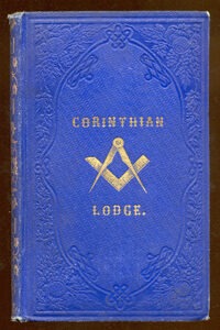
Heavily patterned cloth
stamped in gold and blind (1859)
Building Confidence: the 1840s
Typical bindings have a gold-stamped central vignette on the front cover surrounded by symmetrical frames and symmetrical decorative borders in blind (i.e. without color); the subject of the vignette can be specific to the book, or a generic or stock cut may be used. Vignettes are stamped using hand-engraved brass dies. Among the notable binders’ die-makers is John Feely (who—unusually—likes to sign his designs). Gold begins to be used more freely, especially on spines (where it shows on the shelf). Display typeface styles used on spines become more elaborate. There is a greater variety of cloth colors and grains: pastel colors; ribbed, beaded, hexagonal, and line-and-dot patterns. Books tend to be bound in batches; later batches might use different colors and cloth patterns, and there can be many variants within a single printing of any given text. Binders occasionally use cloth with pre-printed striped, moiré, or other patterns.
Exuberance: the 1850s
Blind-stamped all-over designs are popular, sometimes accompanied by the blind-stamped or gold-stamped publisher’s name on the upper and lower covers. All-over designs, made up of repeated small motifs, are popular. Lithographed paper appliqués or onlays brighten front covers. The variety of colored cloth continues to increase; petroleum-based (aniline) dyes are introduced. Covers can become very elaborate; specialists in book cover design spring up. American cover styles for the most part imitate British ones, and virtually all book cloth used in the United States continues to be imported.
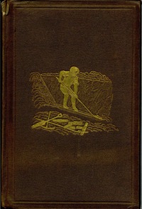
Vignette signed by John Feely (1867)
A Somber Decade: the 1860s
A grim decade in the United States, and one that tended to produce plain bindings in dark or earth colors, with sparser gold stamping; cloth with pronounced grains is popular. After the Civil War, more fine-grained cloth begins to be used.

Eastlake style stamped
in gold and black (1879)
Breaking with the Past: the 1870s
The more pronounced cloth grains begin to disappear in favor of small-ribbed designs, a smooth background for elaborate designs printed in multiple colors—including black, which successfully reappears after a hiatus of nearly forty years. Stylized floral designs with a machine-made look, inspired by the architectural designs of Charles Eastlake, are common. Patterns become increasingly bold and increasingly asymmetric, sometimes using Japanese or other oriental-inspired motifs.
A Busy Time: the 1880s
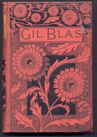
Japanese influence (c.1885)
Complicated diagonal and other asymmetric designs and elaborate display typefaces continue to be popular. Covers printed in multiple colors are common. Stamping in silver (using aluminum foils) is introduced. Towards the end of the decade, the depiction of a scene from the book sometimes dominates the front cover, as a preview of the attractions within. Publishers are increasingly fond of series bindings, where a single design is used for a group (and sometimes a large one) of books, with only the title and author’s name changing from one volume to the next.
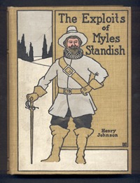
Binding signed by the Decorative
Designers with their DD logo (1897)
The Rise of the Artist: the 1890s
There is a growing sense that good design need not be prohibitively expensive or overly elaborate; gold is used more sparingly. A number of freelance American designers, many of them women, become well–known and highly respected for their book cover work: notables include Margaret Armstrong and Sarah Wyman Whitman. Designers typically sign covers with their initials or logos. Critics begin to note that American cloth cover designs are often superior to English ones. Popular titles tend to be available in an assortment of variant styles within a single design: with or without gold or stained edges; in cloth or sheep or reverse calf. Arts-and-crafts and art nouveau designs are popular. Books are generally sold protected by cloth or paper dust-jackets, the latter meant to be thrown away after purchase (and so they were; pre-1900 dust-jackets seldom survive today). Up-market books often come boxed or in a slipcase.
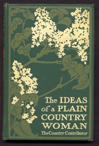
Poster–style binding
designed by Bertha Stuart (1909)
A New Century: the 1900s
“Poster-style” designs flourish, with simple but eye-catching designs with a two-dimensional feel, and with the cloth color an important space-filling component of the whole; designers aren’t shy about using in–your–face typefaces in large sizes. Cloth grained to resemble natural fabrics is popular. Black-and-white and color relief halftone onlays appear on front covers, often using designs or images similar to those on the books’ dust-jackets. Imaginative designs appear throughout the market, from top-of-the-line luxury productions to cheap series bindings; the overall quality of American cloth bookbinding designs reaches its acme.
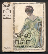
A decorative dust jacket (1911)
Moving Onward: the 1910s
Pictorial onlays continue to be popular; their size sometimes expands to fill the entire front cover. Dust-jackets become increasingly elaborate, and the cloth covers beneath them increasingly plain; publishers discover that it is cheaper to print four-color halftone paper dust-jackets than it is to stamp binder’s cloth in a number of colors. Another style of dust-jacket features a forthright sales pitch, front and back: a description of the contents of the book, quotations from reviews, other titles available, &c. By the end of the decade, odds are that the dust-jacket of a book will be more interesting than the cloth cover beneath it, and the Golden Age of American cloth bookbinding design begins to come to an end.
Bound to Please: American Cloth Bookbindings, 1830–1910, was devised by Vincent Golden, Curator of Newspapers at the American Antiquarian Society. For the past several years, Golden has volunteered his services at Rare Book School (RBS) as assistant to Sue Allen, the foremost authority on American cloth publishers’ bindings, helping her with the logistics of teaching her celebrated five-day RBS course, “Publishers’ Bookbindings, 1830–1910,” offered each July at RBS.
